Writing Revision Reflection

Textual Rhetorical Analysis Revision

I chose to revise my textual rhetorical analysis essay because I felt like it was the paper I had the most room to improve on. It was the first big essay of the semester and I was still stuck in old habits while writing it. For the assignment, we were supposed to pick and article–my topic was sports–and analyze it. Because I am not incredibly sports savvy, this was difficult for me to find an article I thought I could really delve into. After some looking I found and article about concussions in contact sports and thought it was very interesting, so that is what I went with.

I do not think I read the article in depth enough or enough times because my outline is somewhat scarce. It looks like it has more information than in does, so when I was writing my paper, I found that I was running out of things to talk about.  The place in my rubric where I lost the most points was in the substance area. According to the rubric, “Some content is superfluous or not clearly connected to focus. Audience’s needs are not consistently accounted for.” So that means that I need to take the audience into more consideration. It also makes me think that I am being redundant and perhaps added unnecessary content–something I have always struggled with.

In order to improve in the substance category, I would have talked more about the videos. In my original draft, I talked a little bit about the content of the videos, but not enough. In my revised paper, I would add more about what the videos said. For example in the first video I the article, it mentions the term “sub-concussion” many times and goes into detail about what it is; however, I never mentioned that term once in my essay. I would have talked about how even though the written article is about concussions themselves, this video is a good supplement to add more information about sub-concussions. The first video also used ethos by talking to scientists who have been doing extensive research on brain injuries in contact sports. NBC uses actual scientists to back up the points with research which makes them more credible.

In my revision, I would also add more information on the second video in the article. In the second video, NBC also used ethos in this video as they interviewed a neuroscientist, but they also used paths because they pulled at the audiences emotions. There was an interview with a former NFL players’ wife. Her husband struggled with addiction and depression and eventually overdosed. His wife was relieved to hear that the symptoms of CTE (a brain disorder caused by head trauma) matched up with what her husband was experiencing. In the video she said she had “got her prince charming back.” This story makes people sympathize for the widow which is a good use of pathos.

Another area on the rubric where I did not score well was in the organization category where my comments said, “Organization is conventional, showing some attention to audience needs.” In order to fix this, I went into my original essay and changed the order around to make it flow more nicely. I changed it so the third paragraph from my original draft is now the first body paragraph because I thought that stating that the author used credible sources was important. The first and second paragraph in my original draft I changed to be the second and third body paragraphs in my revision. I thought they should stay together because they are talking about similar things. Because I changed the order of the body paragraphs, I had to edit my thesis. I just changed the order of points I listed to match the new order of paragraphs.

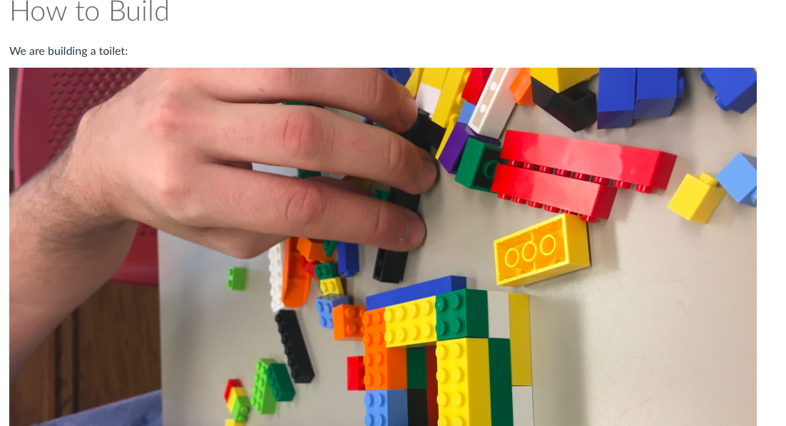
The last change I made was adding a photo of the thumbnail of one of the videos. I thought this made the essay better because instead of rambling on about explaining what the picture looked like, I just showed the audience. Before taking this class, I never would have added images into an essay unless my instructor specifically required it. I have learned from my professor in this course that if I feel that a picture adds and helps the audience understand better then it is fine to include them. When I added the picture I had to cut some senates out. By the picture being in there, it explained itself so I took out my describing the thumbnail.

The one paragraph I did not change at all was the paragraph where I talked about how the author had no sources talking about why people think it’s good for kids to play contact sports regardless of the risk of concussions. I also did not change the into or conclusion paragraph because I thought they were sufficient.

By revising this essay, I have learned to take an essay that I did not do very well on and make it better. As I said my group was supposed to analyze an article about sports which is something I do not have a lot of knowledge on, so when deciding what to revise I really did not want to go back to the paper that interested me the least. However, it was the essay that needed the most revision. In a work environment I am going to most likely have to work with a topic I am not extremely  interested in at some point, and I will not want to come back to fix thing about it. Times like this where I have to continue to work on a project that were hard for me are the times when I grow the most as a writer and communicator.
Electronic Reflection

In this reflection, I will be reflecting on my website as a whole. I have used WordPress before for my high school’s newspaper, but have never gone as in depth with it as I did for this portfolio. I have always liked online content and think that it is how most communication is done now and will be done in the future. There are many benefits to posting on the web and there are a plethora  of things one can do online.

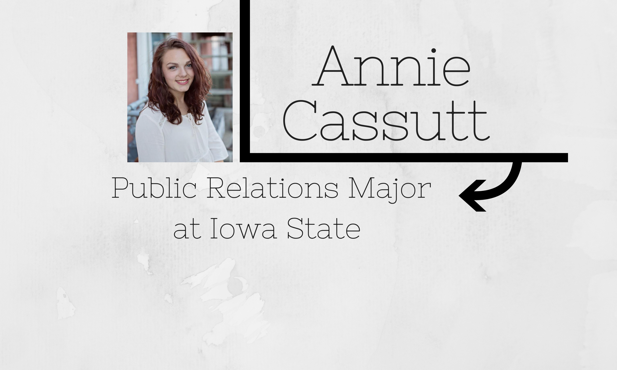
Being the author of this website comes with many great advantages. Being able to change the layout, content, and colors. I started with the generic picture that WordPress gave me. In my first post, I have the default photo I started with and talked about what I hope I would learn about WordPress thus semester. One of my favorite things to figure out was my new header graphic. For another class, we were required to have a professional photo of ourselves and so I chose one of my senior photos. I then decided I wanted to add my name, major, and school so that it would be apparent who I was right when someone enters the site. In order to make my header graphic, I used canva.com, which is a free, easy graphic design website. After many tries getting it to be the right size, I finally landed on one I thought fit my site and personality well.

Being able to change my header really changed the whole look of the site. I also changed the title to say “Annie’s Portfolio” so that it made it obvious what the purpose of the site was. Since I was creating a portfolio for two different classes with different requirements, I decided to make my ENG 250 categories in their own menu. I like that I could do this so that the top menu bar did not get cluttered with all kinds of different options.

With having a personal website, it makes me easier to be contacted by employers or whoever looks at the site. I have my contact information on there for anyone to read and there is also open commenting to promote feedback if necessary. It is much easier to see someone’s online portfolio than a physical one and it is so much more simple for me to add and subtract from it. For example, if I want to show someone my documented essay, they can just click on that link and it will take them right there instead of having to print everything off.

The ePortfolio has helped me learn so much about WordPress and electronic communication. As my college career progresses I can add and subtract from this whenever I want as I complete more work examples. This site makes it easy for future employers to see my work and contact me in a variation of ways if they like what they see. I hope to continue to expand on my learned knowledge of electric communication in the years to come.

Visual Reflection

For my visual example, my best pieces of work were my visual analysis , my visual analysis practice,  and my groups in class visual activity.

These are my best examples because they demonstrate a wide range of different skills I have within visual communication. The visual analysis video was one of my favorite projects because it was different than anything I had done in previous English classes and I enjoy making videos. I thought the visual analysis practice was a good example because it was still a visual analysis; however in this case, instead of analyzing something by making a video, I was analyzing a video itself. The third example of our in class visual activity is one of my best examples because I in charge of creating the meme part of it which is kind of like making a graphic.

When I was analyzing the videos for my visual analysis practice, we looked up videos from “How it should have ended” on Youtube. These videos were short, animated clips about popular movies where the creators of the Youtube video change the ending form the original  movie. In this case, I had to keep in mind who the audience would be. I chose to analyze Hunger Games and Harry Potter because I had previous background about them because I have read the books and seen the movies. The audience in this case would have been people who have seen or read Harry Potter and Hunger Games. If I had watched a video about Back to the Future, I would have been a bad audience member to analyze it blue I have never seen how the movie actually eded.

When I was making the memes for the on class assignment, the audience was my fellow classmates. I had to make sure I used memes that everyone knew and that my captions went appropriatley with the memes. I read the directions as the memes were supposed to be about social media and how people from Shakespeare’s time would think of it. I tried to poke fun at social media because of that while also keeping in mind that the people viewing them were millennials.

When creating the in class visual activity, my group and I worked collaboratively on the three aspects; therefore, I received feedback from the two other members of my group about my memes. There were three people in my group and three different visual tasks, so we assigned one to each person. Even though we all had our own activity to focus on, we still had to help each other and give and receive feedback about how to improve our mini projects.

Like I said about my visual analysis video, I made changes from my practice drafts to the final draft regarding weather or not I should use headphones and if I should sit down or stand up. After prancing it various ways I changed it to sitting with headphones for my final draft. This made the video much more clear. For the meme activity, I tried many different quotes with each meme picture. I had to make sure the caption fit the photo correctly and that it was somewhat funny, as that it what memes are supposed to be. When I was working on the how it should have ended responses, I had to watch the videos multiple times and therefore had to change some of my analysis as I watched more in depth. After watching each video multiple times and finessing my answers, I think it made the responses more accuarte.

These examples of my visual communication are good because they show my diversity within the realm of visual communication. The video shows that I am able to use iMovie and record my voice in order to make an adequate analysis. The practice analysis shows my ability to watch another video that someone else made and objectively analyze it. The in class visual activity shows my ability to create a specific graphic for a specific audience. All of my visual communication projects have helped me grow in this area and pushed me to try new things. All of these skills–making a video, analyzing a video, and creating a graphic–are all applicable to my other journalism and public relations classes.

Oral Reflection

My Best Oral Analysis

I think my best example of using oral is my visual analysis video. I had to write a detailed script so that I could deliver it orally up to par. I had to make sure I spoke clearly into my computer which is something I struggle with since I speak very quickly.

Reflection

I chose my visual analysis video as my best example of an oral project because  it was the only one that I used oral communication and because I thought it was a unique project and I put a lot of work into it. When I started the project, I came up with a tentative schedule of when I wanted to accomplish each step. On other projects, I have made a plan before; however, I rarely stick to it. In this project I stuck to my plan and therefore I feel like it turned out better.

For this project, my audience was social media , specifically Instagram, users. I chose to analyze Jaden Smith’s Instagram theme. The audience was somewhat specific because if someone did not have Instagram, they would have a harder time understanding certain terms I used. Even some that have Instagram do not think very much about each post and may not understand what having a grid theme even means. My audience had to be people who are relatively Instagram savvy. The way I tailored the project toward them is by using terms they would understand and explaining things as if I was talking to them.

To make the actual video, I used iMovie and recorded my voice over the images. When I was creating it, I tried several different methods of how to record my voice. Weather to sit or stand and weather to use headphones or not. After trying different variations of those options, I decided that I would sit down and wear headphones in order to create the clearest sound. I think that was a good change because when I first started recording I was doing it without headphones, and it did not sound as crisp.

This project is an obvious demonstrated for an oral presentation. It’s a video where I am talking in it. Most projects I have done in the past in English classes do not involve speaking unless it is a presentation in front of the class. I liked that this project was like writing a paper, but I just essentially read it out loud.