Joshua Wooi
Professor Meredith Smith-Lane
English 250
14 March 2019
Visual Rhetorical Analysis: ‘The Birth of a Nation’ movie poster
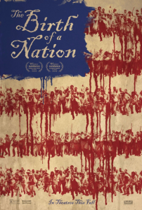
 Released on October 7th, 2016, ‘The Birth of a Nation’ is a movie that follows Nat Turner, a literate slave and preacher, whom orchestrates an uprising in the hopes of leading the enslaved to freedom during a dark time in American history (“The Birth of a Nation”). To promote the film, the company Silenzio Communication was outsourced to design the theatrical release poster for the movie. This collaboration resulted in a poster that is both complex and compelling in the subliminal reasonings behind its presentation.
At a glance, it should be obvious to all that this poster resembles the American flag. This would suggest that the designers are attempting to appeal to a predominantly North-American audience. Also, considering that the title of the movie is called ‘The Birth of a Nation’, and it is in relation to a depiction of the American flag, it’s fair to assume that the movie would be about the “birth” of America. Hence, the argument may also be made that it appeals to any “history buffs” with an interest in American history.
As previously mentioned, it is by design that this poster resembles the American flag in its composition. A block of blue is positioned at the top left corner, which creates a space for the title of the movie. Not only does the pop of color break up the stale sameness of the rest of the poster, it naturally draws the attention of the eye. For those reasons, it effectively communicates the title of the movie, while also giving the poster an aesthetically pleasing sense of dynamics. Moreover, the human figures portrayed in the poster are all positioned in lines and depicted in red. When arranged in rows and illustrated against a white background, it creates the illusion of red and white stripes. All these elements come together to ultimately create a semblance of the American flag.
Upon closer inspection however, some interesting details reveal themselves. The “stripes” are seemingly dripping in places as though made of blood, which may be a stylistic choice to represent bloodshed. This idea is supported by the choice to depict the human figures in red, which is commonly used to represent conflict and aggression. Likewise, the people in the group are holding fighting stances, which further suggests the presence of tension and aggression. All things considered, one would be led to believe that there would be some depiction of violence in the movie. Furthermore, this poster does not put its attention on any one human figure, but rather depicts human figures in large groups. This is indicative of the focus on an issue that affects the masses rather than individuals. One thing is for sure however, this movie may not be suitable for the faint of heart.
The color choices in the design of this poster should be obvious at this point, but what isn’t as clearly expressed is the choice to utilize darker, more muted shades of the red, white, and blue. Darker shades and tones of colors are generally associated with unfavorable feelings, which would be an appropriate use considering the movie’s context. The designers may be attempting to evoke the sense of grimness, hardships, or desperation by making this choice, which aptly reflects the social environment of the time period set in this movie.
As a final point, this poster has constructively communicated the spirit and overall tone of the movie in a visually consumable manner. Without too many words, much has been said by this poster through its effective use of text, composition, stylistic details, and color. The content covered in this paper has barely scratched the surface of the poster artist’s intent, which just speaks to its effectiveness in terms of visual communication.