Reflection: Rhetorical Analysis
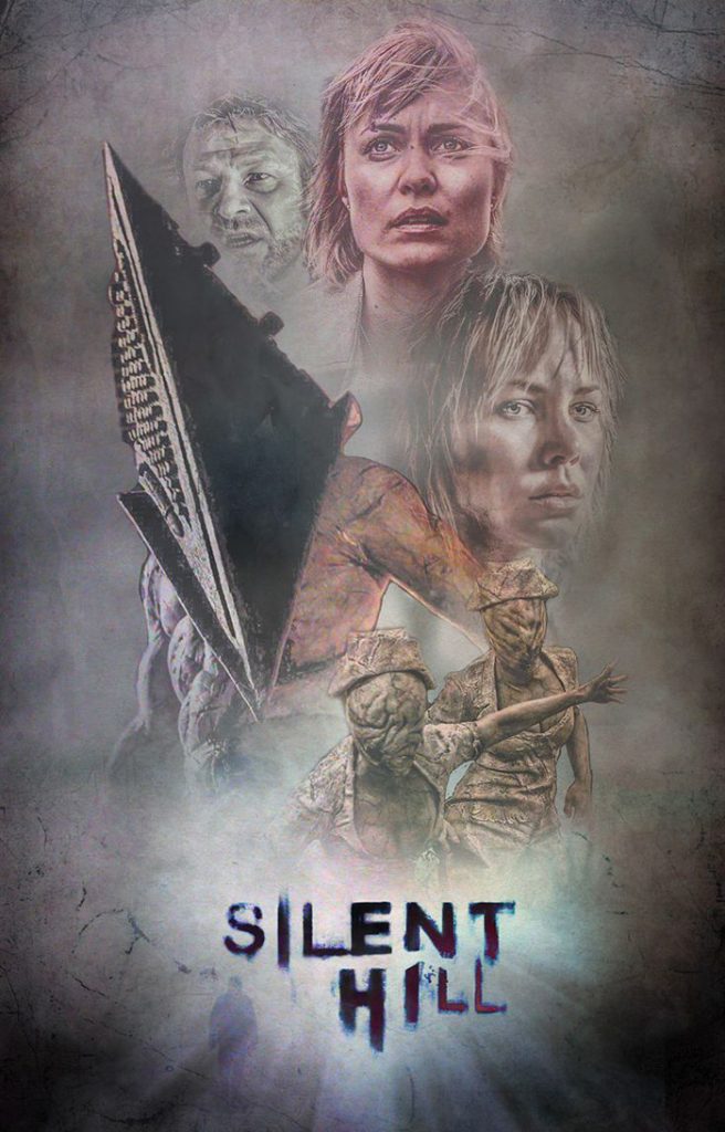
My rhetorical analyses on a poster from the movie Silent Hill was a great decision on my part. With not having a lot of text to go off of on the poster, I had to really look at how the design was used to pull people in and give off emotion on the movie. I really focused on the colors of the poster and how each color provoked emotion. My focus with the characters on the poster was to write about how “putting a sense of unfamiliarity and deformity creates discomfort”. When first writing the paper I jumped right in with different pieces of the poster and how they worked with different persuasive techniques. I changed this as I continued my rough drafts, I wanted the opening thesis to explain the illustrator and his background in poster making. The changes I made most in the drafts was the flow of my paper. I went from one thing to the next in a very choppy writing style. In my second draft, I made sure to move sections around and connect them in a more seamless way. The two ways of rhetorical analysis were more similar than different. Although I found it more fun and easy to explain my thought when presenting the visual text.
Movie Posters / Key Art: Creepy Duck Design
https://www.creepyduckdesign.com/